
Flexbox 的 min-width 和 max-width 声明在 Safari 上不起作用?为什么?
htmlweb developmentfront end technology更新于 2024/7/25 19:24:17
要使 Flexbox 在所有 Web 浏览器上都能正常工作,请使用 flex 的 min-width 和 max-width 等效项。例如,对于这个 −
min-width: 40%;
max-width: 40%;
使用 CSS 简写属性。它声明 flex-grow | flex-shrink | flex-basis,语法如下 −
flex: flex-grow flex-shrink flex-basis|auto;
对于上述情况,我们可以将 Flex 设置为 −
flex: 0 0 40%;
现在让我们看一个适用于所有 Web 浏览器的 Flexbox 示例。我们的父 div parentBox 内有两个 div -
<div class='parentBox'>
   <div class='childBox'>
      <div class='babyChildBox'>Parent's Child</div>
      <div class='babyChildBox'>Parent's Child</div>
   </div>
   <! - - -
   !-->
</div>
父容器的样式。我们使用了 CSS Flex 简写属性 -
.parentBox {
    display: flex;
    flex: 1 0 100%;
    background-color:yellow;
    border: 3px solid skyblue;
}
对于子容器,即 childBox,我们再次使用了简写属性来设置弹性项目的弹性长度 -
.childBox {
    flex: 1 1 50%
    background-color: green;
    color: white;
    border: 1px solid blue;
}
上述 .childBox 中的嵌套子容器已使用 Flex 设置。这段代码和上面的代码嵌套了弹性容器 -
.babyChildBox {
    flex: 1 1 50%;
    background-color: orange;
}
示例
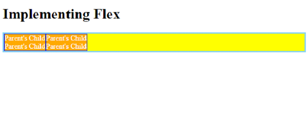
以下是完整示例 -
<!DOCTYPE html>
<html>
<head>
   <style>
      .parentBox {
         display: flex;
         flex: 1 0 100%;
         background-color:yellow;
         border: 3px solid skyblue;
      }
      .childBox {
         flex: 1 1 50%
         background-color: green;
         color: white;
         border: 1px solid blue;
      }
      .babyChildBox {
         flex: 1 1 50%;
         background-color: orange;
      }
   </style>
</head>
<body>
<h1>Implementing Flex</h1>
<div class='parentBox'>
   <div class='childBox'>
      <div class='babyChildBox'>Parent's Child</div>
      <div class='babyChildBox'>Parent's Child</div>
   </div>
   <div class='childBox'>
      <div class='babyChildBox'>Parent's Child</div>
      <div class='babyChildBox'>Parent's Child</div>
   </div>
</div>
</body>
</html>
输出
相关文章
有用资源
html 参考教程 - 该教程包含有关 html 的更多信息:https://www.cainiaomax.com/html/